Potential can be found in just about any space if you have the eye for it. Inspiration may not strike when you’ve grown up in an unorganised and aging interior, but this dazzling family home makeover reflects the fresh taste of a new generation. This family home was revamped by Simple Interior Design Alliance for the daughter of a writer, sprung from an avid reading family. This writer’s home was filled with books and clutter, and was crying out for a complete redesign. The layout of each area was replanned to maximise light, and the decor received a radical overhaul that included a long overdue installation of organised storage solutions.
Before the remodel, rickety storage made the hallway appear makeshift and overcrowded. The dimensions of the hallway are actually quite spacious, though you’d never have known it surrounded by dingy decor and sagging wiring.
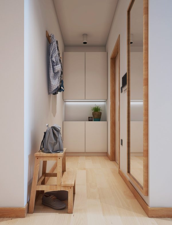
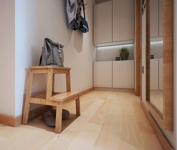
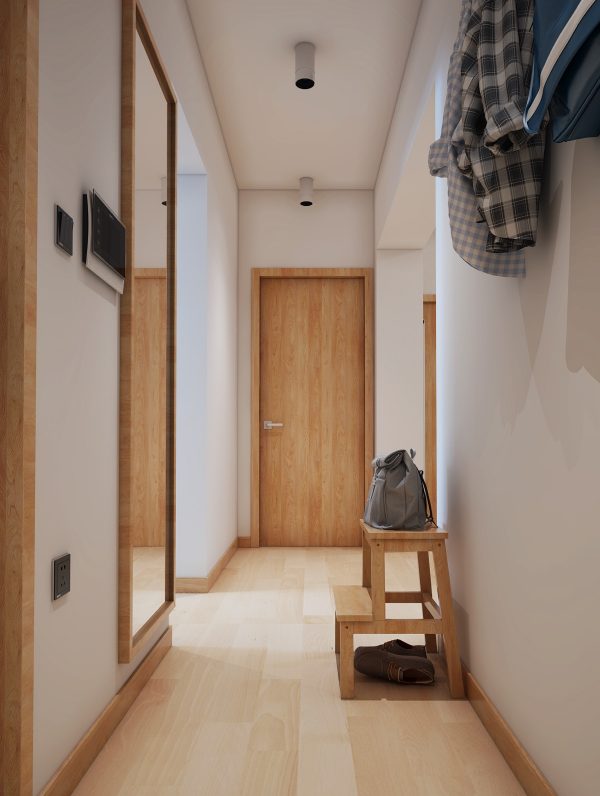
The revamped hall is now a fresh vision of white decor and wooden accents. Four large cupboards are flush fitted where the old open shoe rack used to balance. The ample storage units are white to blend with the walls; they have an open shelf through the middle to show off the depth of space. A white LED strip makes the recessed shelf look light and clean.
All of the old exposed wiring has been hidden in the plasterwork.
Now first impressions of the home are bright and welcoming.
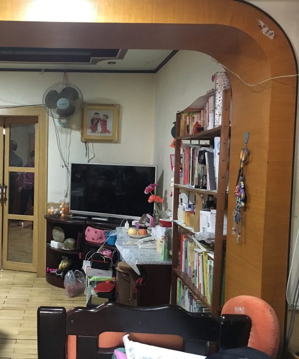
Before the revamp, the living room was a scene of chaos, with bad lighting and ventilation.
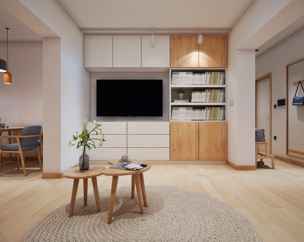
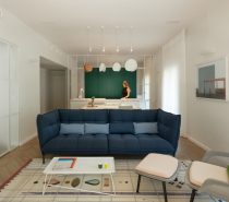
The remodel of the living room involved an adjustment of the wall marking the divide between the lounge and the hall, to square off the opening. At the other side, interior doors were removed to make the dining room part of the same continuous living space. The new TV wall decor involved adding plenty of storage space for media items, and to catch other stray belongings. The design was also geared to bring in a feeling of closeness to nature, with an abundance of natural colour, wood grain and leafy accents.
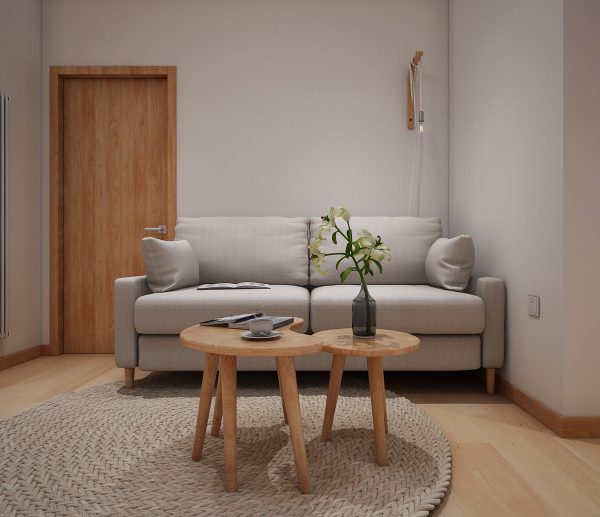
Wooden nesting coffee tables mimic the shape of a crescent moon and a full moon. A decorative vase brings a touch of elegance to the room.
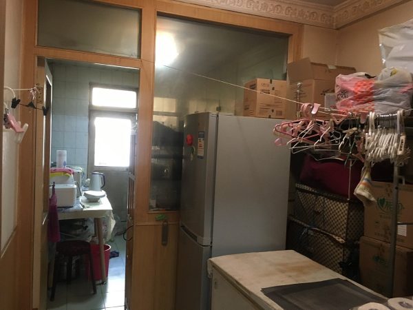
Before the transformation, the dining room was non existent. Bad space planning meant that this area was originally utilised as extra kitchen and utility storage.
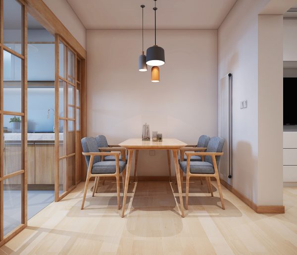
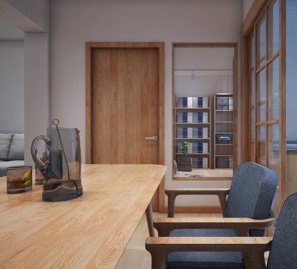
The reinstatement of a dining room makes the home appear abundantly more spacious. A cluster of three dining room pendant lights are fixed over the eating area, making it appear as though the table has always been right here. Wood framed sliding glass doors have been installed to allow the kitchen sounds and smells to be screened from the rest of the living area when desired.
A smoked glass pitcher and drinking glasses sit poised on the wooden dining table. A clear window is situated in the study wall opposite the modern dining set, letting borrowed light flow through.
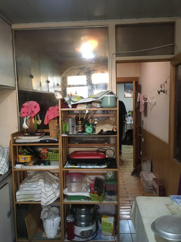
Before the kitchen received its overhaul, the badly aging units were beyond shabby. The so-called decor was a hodgepodge of styles and finishes.
An overspill of kitchen paraphernalia filled two towers of temporary shelving.
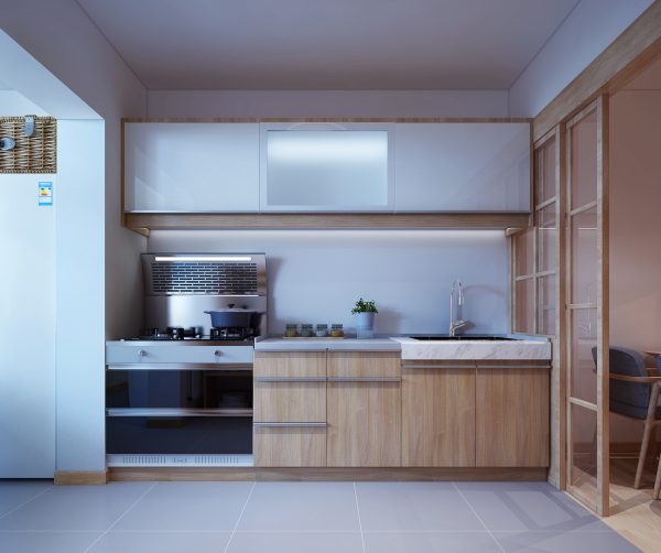
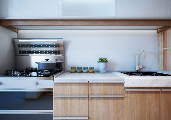
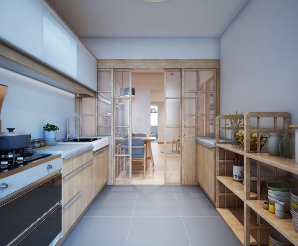
Now, the shiny new white and wood kitchen is unrecognisable as the same space. A high spec oven with an integrated extractor hood brings the cooking space bang up to date in technological advancements.
The space that was originally occupied by the old hood is now able to be used in a more practical way, for concealed storage that helps maintain the new level of order and hygiene. A neat spice rack and an indoor herb planter are the only items left out on the countertop.
The kitchen still accommodates a selection of open shelving units but now they are sleek in appearance, with visually pleasing displays.
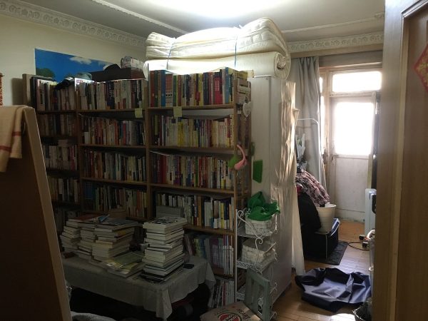
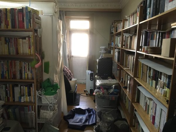
Before the study was tamed, the books seemed to commandeer the space as their very own!
The packed home library was the product of the girl’s writer father who relished reading. However, the overwhelming book collection also created a breeding ground for other household clutter.
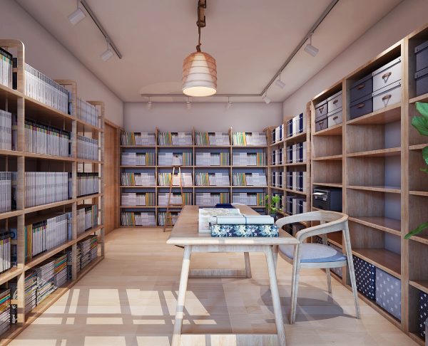
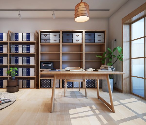
Uniform stacks now crisply populate the study. The calmly organised space is now inviting and conducive to work and concentration.
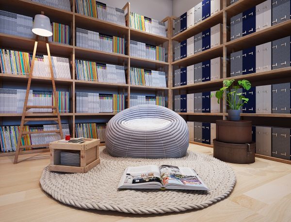
There is also space for a cosy reading nook, in the shape of a cool bean bag chair and a floor reading lamp on a woven rug island.
A concrete planter introduces greenery to the room.
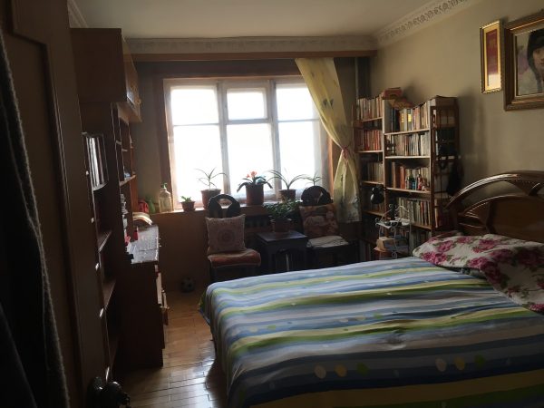
Before overlaying the new decor scheme, the original positioning of the bed was nostalgically maintained.
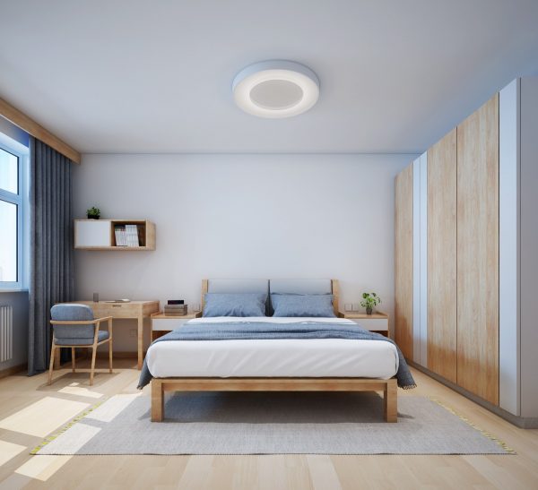
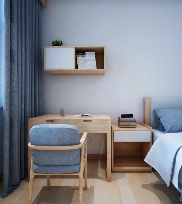
The old crown moulding was removed to create a more minimalist bedroom. The same soft grey, white and wood tone colour scheme was brought through from the living area.
The desk chair in the bedroom is a repeat of the dining room chairs, which means that this piece could be called upon if an extra guest comes by for dinner.
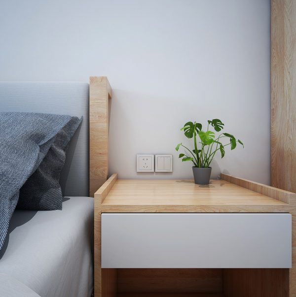
On the other side, a bedside unit cradles a indoor house plants here is the Swiss Cheese Plant.
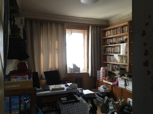
Before this room became a guest room, it was used as a home office.
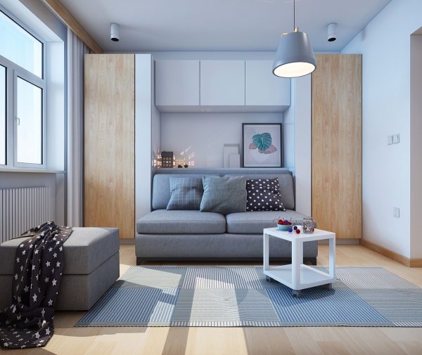
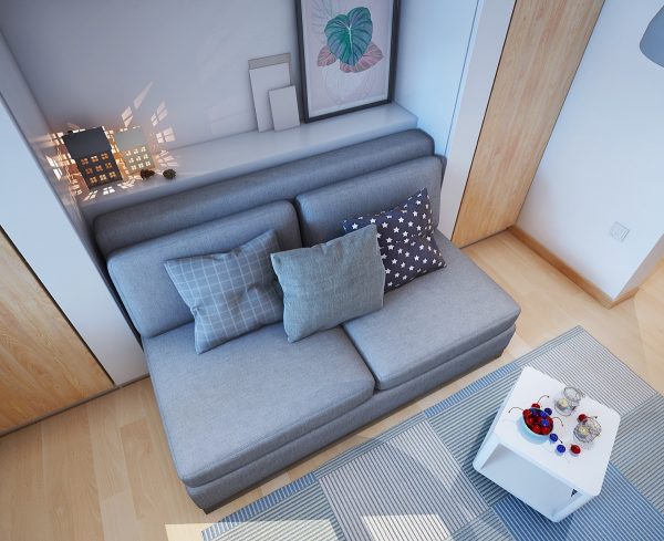
A sofa bed was selected instead of a fully-fledged bed since this will only be slept in very occasionally. Offering a comfortable place to sit means that this room will receive more use.
Artwork and cute house shaped flameless candles are displayed on a shelf behind the bed. Wall units span the space above the ‘headboard’ shelf.
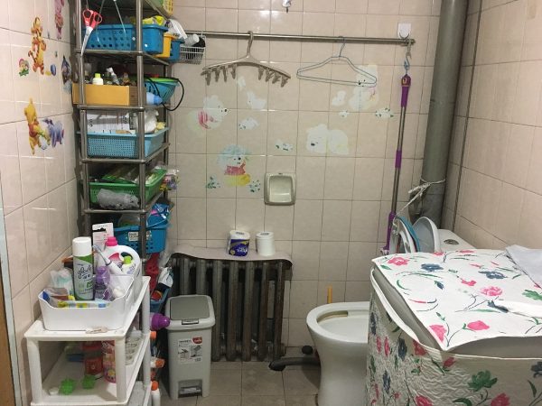
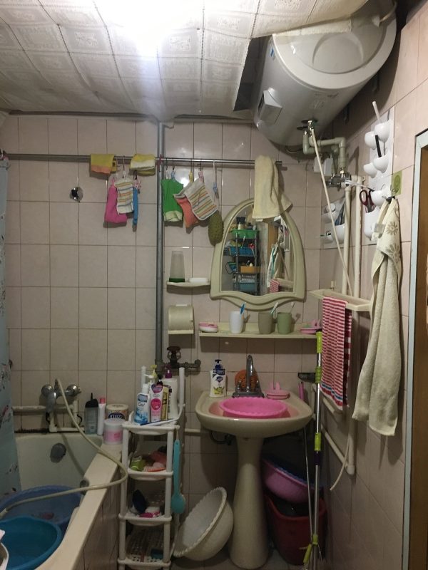
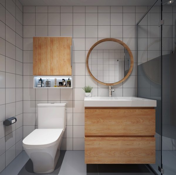
Before the renovation, the bathroom was a complete disaster. A crazy concoction of storage baskets spilled from an ugly storage rack and childish transfers danced across dated wall tiles.
The visual noise made the crowded room feel uncomfortably narrow.
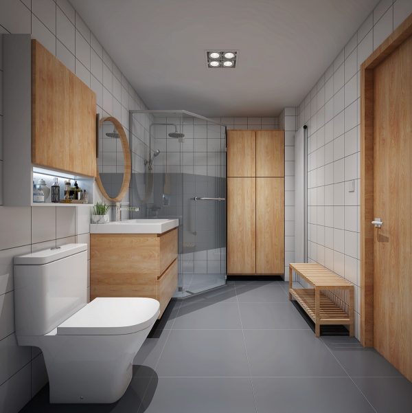
Matching wooden bathroom cabinets and smooth grey floor tiles make the newly designed room look astonishingly more spacious.
Recommended Reading: Singapore Flat Multifunctional Makeover
Related Posts:
 Industrial Style Dining Room Design: The Essential Guide
 A Home With Formidable Architecture And A Light Interior
 2 Apartments Under 30 Square Metre – One Light, One Dark
 True Open Plan Apartment Under 50 Square Meters (500 Square Feet) With Floor Plan
 Child-Friendly Industrial Style Home
 Bauhaus Style Home with Interior Glass Walls


